2009年5月6日水曜日
2009年4月14日火曜日
Helvetica response

The film Helvetica was really interesting because I have not payed attention on typography that much. After I saw the film, I start to notice that so many letters around me are Helvetica. However, in my daily life, what I saw most is New Times Roman. Newspapers, books and articel I read are most in New Times Roman. Also I use New Times Roman to write papers. Because of these reasons, my image of New Times Roman are scholary, formal, or grumpy. Compared to this, as many designers mentioned in the moveis, Helvetica is simple and easy to read. I strongree agree latter point. Since I am taking children's literacy class, I read many picture books, many of them are written in Helvetica or similar style. I guess that the point using Helvetica is that it makes children to read words easyier.
Another point that I thought interesting about typography is that why people use Helvetica. In the film a lot said that Helvetica is simple and because of its simplicity Helvetica does not give much images such I have for New Times Roman. Since I am Japanese and I use Chinese charactors, it is difficult to see the point that typography changes the image of words becuase almost all chinese charactor has a meaning. Many Chinese charactors came from picture, which shown in a figure above. If the letter is in Helvetica or New Times Roman it does not make difference in the meaning of letter.
2009年4月7日火曜日
Hirshhorn Museum I

Arch of Hysteria (1993)
Materials: Bronze, polished patina, hanging piece
This sculpture looks like a pole vaulter who is jumping.
Also it seems like a man is comfortable and fascinated.
However, as the title tells, it represent Hysteria which means that this shows extreme tension.
For me, image of Hysteria is women's symptom but this sculpture is more like a man.
Also because of its beautiful curved line, it gave me a sense that this is a woman.
Since Louise Bourjois' works are represent her real experience, this is the case as well.
I think that the feeling that I got from this work which is tension and comfort are two components of her life: hard experiences from childhood and release from it.
And these two component circulate as the sculpture draw a beautiful curve.
2009年4月1日水曜日
photo narrative 2
 My object in the series of pictures is "sky".
These pictures shows my friend going up to the highest point in Machu Pichu, Peru.
Sky is the object which represents her rise of expectations to see Machu Pichu from the best point. Also in these pictures, my friend has a bag with her however in the end she does not. She had so many things in her mind before seeing Machu Pichu. But becuase it was so buetiful she could forget everything she had in her mind for a moment. Bag represent this.


2009年2月25日水曜日
Design Project
2009年1月27日火曜日
object pictures


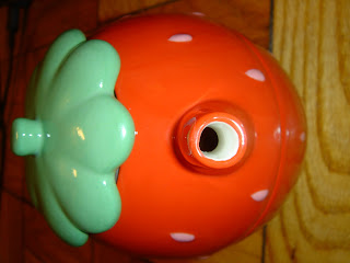
 I chose these pictures because they were taken from different angle or in different lighting. My favorit photo is last one. In this photo, the pot is reflicted in a mirror. It looks like kissing. If I make a title for this photo, it is going to be "love". This tea pot is my jewel. I got this from my gramma when I left my home, Japan. She gave me this because I cannot live with out tea. lol.
My gramma is no more in this world... This became a last present from her...
2009年1月21日水曜日


It was fun to take this kind of photographs because these are different from pictures I usually take. Look for something to take was also new experience.
This assignment made me to realize differences of textures that I do not care normally. Also by taking pictures, materials looks different becuase I do not see things close up.
登録:
コメント (Atom)


